![BillEverettSplashPage_thumb[2] BillEverettSplashPage_thumb[2]](https://blogger.googleusercontent.com/img/b/R29vZ2xl/AVvXsEjShel_V4BGogpP_fqGTKZbxLTzCSoVdgYRkTu9Ib2z3JuHn7bpnM-3Uqz3WrsZv9CXuHV_bTQp5waB6N5owecJJnYzUgHxXmoFvQul2l53Zad9oLufhf5bB6-2QnGglJXksFEatH9cx5k/?imgmax=800)
Among the true lost gems of comics are the forgotten horror stories Bill Everett drew (and in some cases wrote) for Atlas/Time/Marvel in the 1950s. We are pleased to present three of these long unseen minor masterpieces in this first of several posts we’ll make in appreciation and analysis of Bill Everett’s work of this period. In this post, we examine the connecting theme of alienation that runs through a great deal of Everett’s best work.
OVERVIEW
To set the stage and help show that what Everett accomplished in his own quiet way was truly extraordinary, a brief overview is in order. Most would agree that Atlas/Timely/Marvel comics of the 1950s were far from innovative. Their output was the sheer opposite of publishers such as E.C., Hillman, and a few others. If a trend seemed popular, ATM (as we’ll call them, for brevity’s sake) hopped on the bandwagon with a desperate energy.
![Atlas-Marvel-E.C.-splash-comparison_thumb[3] Atlas-Marvel-E.C.-splash-comparison_thumb[3]](https://blogger.googleusercontent.com/img/b/R29vZ2xl/AVvXsEhoNSmGyC4JPvO_OFVex5_oWIE2WrX3O3g0af3p5DHAHsKTlaSuWNgao0EPMidx8w6zJabk-5Km2N9Rz-YjwIfOlxrs0slh-cSZKgQgixFanW7xfDO2CCKuhWhRIIHkPkHKOaIzOwvaAkk/?imgmax=800)
A survey of ATM’s 1950s comics reveals one copy-cat effort after another—in genres from war to horror to romance to funny-animal. This cynical trend-surfing served ATM well—even during the comics recession of the later ‘50s, when the company threatened to expire.
ATM had no house style. Although editor Stan Lee was quite fond of the impressionist pen-scribbles of Joe Maneely—and encouraged other ATM artists to attempt the artist’s style—he allowed his stable of cartoonists to pursue their own look and feel.
![Joe Maneely Marvel Tales cover_thumb[2] Joe Maneely Marvel Tales cover_thumb[2]](https://blogger.googleusercontent.com/img/b/R29vZ2xl/AVvXsEjVrA-58DCG5DhGjyxFqjc5vLGRwsSuU2mDvplietR-uAL3smKeOvIvwvqHL1zaZ1wmUi7VBY0Nls_QtR1xjNoqJ3dH4Nzp38ZYpZuWkBcfZv6rIbq-7l5IYShzCBdzgY2i6V1jC3g7UVs/?imgmax=800)
The freedom allowed artists at ATM in the '50s was comparable to E.C.’s pursuance of highly recognizable artist styles. However, where E.C. had a limited number of titles, and strove to fulfill a vision of the highest possible quality, ATM had an ever-shifting army of exploitative books to be filled. Thus, their artists could pretty much do as they pleased, because there was likely little time to art direct. In fact, most of the E.C. artists wound up working at ATM in the latter 1950s, after E.C. collapsed. It’s a sure bet that ATM artists worked with open copies of E.C. comics at their elbows (as is likely today in many cases).
This laissez-faire attitude attracted notable stylists to ATM throughout the 1950s. Gene Colan was able to develop an eccentric, chiaroscuro style through sheer trial and error, spread over dozens of stories. Bernard Krigstein was probably less constrained at Atlas under Stan Lee’s loose editorship than he was at E.C., and turned in numerous impressive stylistic experiments (which we plan to look at at in a future post). Bizarro cartoonists such as Matt Fox and Robert Q. Sale were similarly free from constraint.
Weird Worlds 27 (March,1953)
![matt Fox Atlas Marvel Splash Page Alien Weird Comics_thumb[2] matt Fox Atlas Marvel Splash Page Alien Weird Comics_thumb[2]](https://blogger.googleusercontent.com/img/b/R29vZ2xl/AVvXsEgGHkU83L-Mc0ZoOkQZr0HdPvhOei9uYd6rvXld8hWeUjtG_l3TMpQjPH5rmTsalKJAi2Bz-9UuyuS4R3fnxp0imvxvBvpu-cmZNHdRpLqQeC9zZWvR3pEft9w2eweZhI2MzWo-TFb8cQ0/?imgmax=800)
Below: Robert Q. Sale Splash Page
Menace 10 (March, 1954)
![Robert Q. Sale-Menace_010_thumb[2] Robert Q. Sale-Menace_010_thumb[2]](https://blogger.googleusercontent.com/img/b/R29vZ2xl/AVvXsEh5W1V5KriNrKmysPtiOx_G8jnE3-AMDdxAKZdeKts9ytLPbnaYk-G8XjTtnoZXUxilTXUWCIeScP9e7gDr6F_F7mXXIDK5ESZ5CY4bfV4fP4IKNMhLWCHTw0TY0hYLEnGyy6Vm3sfT5yc/?imgmax=800)
ENTER BILL EVERETT
The few genuinely great artists in the ATM stable had the opportunity to hone their accomplished styles—and to experiment with visual storytelling. Among the best of these artists was Bill Everett. Just take a look at this masterful tier from “Ghost Story,” which first appeared in Amazing Detective Cases #13 (July, 1952). This cinematic sequence shows Everett’s sophisticated graphic draftsmanship and his uncanny ability – similar to a film director -- to select the perfect image:
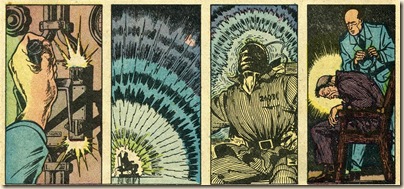
Everett was a major player in the Timely-Atlas story. He was in on the ground floor of the imprint’s history. His character of Prince Namor, the Sub-Mariner, gave comic books one of its first and most influential outsider characters. Namor was immediately popular. Via a series of epic book-length battles with Timely’s other early superstar, the Human Torch, Sub-Mariner soon garnered his own title, and also appeared in various Timely anthologies.
Below: Comics' First Great Anti-Hero – The Sub-Mariner
Marvel Comics #1 (1939)
![bill everett sub-mariner original art_thumb[3] bill everett sub-mariner original art_thumb[3]](https://blogger.googleusercontent.com/img/b/R29vZ2xl/AVvXsEgbxdqL8vajlY8R9OxCeozF6Eifzn77tjVJVF1xhU8luV0djaF8mu7EXSlmGzODUNQJbMcphyNfXwh-Sc7rOyyg9sdcrcW5LbozCeHhlYJjsM9HWiBUbXieBrDkwbr_Qx1m7Gw3Ol49TR0/?imgmax=800)
Everett, like his most lauded creation, was something of an outsider as well—even though he had a considerable hand in shaping the destiny of the American comic book. His feverish, fairy-tale flavored storytelling, coupled with an art style that effortlessly slid from caricature and comedy to sleek, stylized realism, was neither fish nor fowl. As the super-hero genre conformed to an increasingly prosaic look and feel, in the 1940s, Everett’s work refused to march in step. If anything, it became more florid in its dance between cartoon and representational drawing.
ATM became Everett’s home base. Though he would work for other companies, he kept coming back. There, he could draw—and write—in his own chosen manner, with little or no editorial harness.
Everett clearly relished this freedom. Even when illustrating dirt-dumb scripts of Lee and other ATM writers, Everett put his passion and personality on every page, in every panel.
Everett's investiture in his 1950s work is striking. Textures, atmospheres, senses and moods vibrate from his brushline. This line could be gossamer as a spider’s web, or bold as a woodcut. Relatively realistic figures shared panel space with goggle-eyed, distorted caricatures. Visual detail could become baroque—or be pared to its essentials.
When Everett was able to write his own material, the stories themselves become as forceful and impressive as the artwork.
The theme of the alienated outsider that started with the Sub-Mariner in 1939 appears constantly in Everett’s ‘50s ATM work. Like Jack Cole, Everett was sometimes in the thrall of a few pet themes. These give his stories a compelling impact that, like Cole’s work for Quality Comics in the 1940s, stands out like a beacon in the comics where they appeared.
THE MEN FROM MARS (1954)
In “The Men From Mars” from Adventures Into Weird Worlds #25 (January, 1954), the theme of alienation couldn’t be stronger. This mini-masterpiece pre-sages Jack Finney’s seminal 1955 novel, Invasion of the Body Snatchers (which was serialized in the Saturday Evening Post after Everett's story appeared in 1954).
The story – more than likely written by Bill Everett himself – also is simpatico with the early works of Philip K. Dick, such as Time Out of Joint (1959). These landmark novels filtered the post-war angst and consumerism of the 1950’s through the burgeoning genre of science fiction. Everett’s story here, does the same.
While the story is unsigned, it's clearly all from Everett’s hand—including the splash panel. Atlas sometimes had other artists touch up—or draw new material—for the all-important splashes. Although the opening blurb (and the story’s title) aren’t by Everett, the splash otherwise vibrates with the nervous, dense texture of his pen and brush. The monster-masked female face, at the bottom of the panel, contains some trademark sensuous Everett brush-lines. The fine pen lines of the frightened male character’s hair (and the stripes on his shirt) are also typical of his finely detailed ‘50s work.
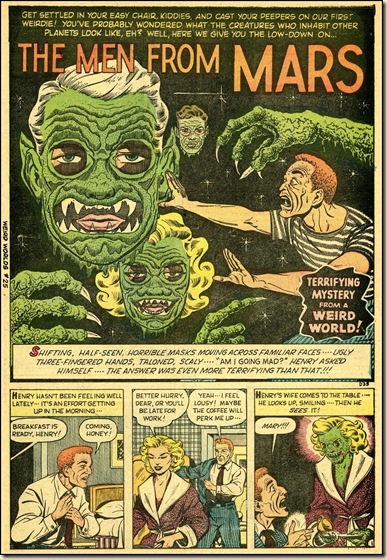
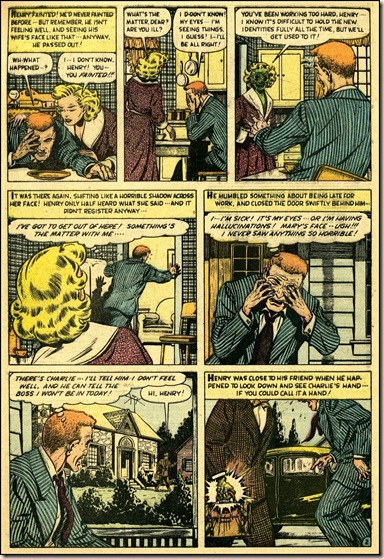


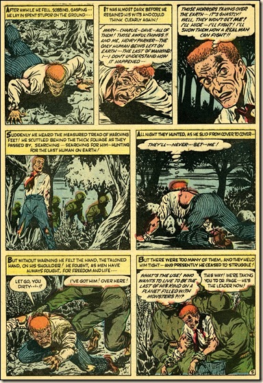
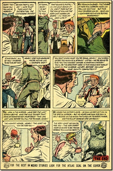
Henry Parker, the story’s protagonist, awakes one morning to find the world he knows—or thought he knew—torn asunder. His wife, neighbors and family physician aren’t human anymore. Everywhere he looks, what he once considered humanity has become repulsive. Yet, this has suddenly become the status quo. Henry is truly alone in the world.
Even trusted figures—Henry’s doctor, and a troop of soldiers that appear on the last few pages—are rendered truly monstrous. Note the military figures on p.5. Everett stresses the faceless institution of the armed services. In an era of gung-ho war comics that celebrated the fightin’ men of Korea and World War II as strong individuals, these non-human soldiers are truly chilling. Everett conveys, via his graphics, a powerful sense that the institutions of society have been vanquished by monsters who don’t share his protagonist’s values—and his humanity.
The matter-of-fact attitude of the Martians (who, as in Finney’s novel, have appropriated the bodies and identities of human beings) contrasts with Henry’s ever-heightened freak-out. The horrifying revelation that Henry is really a Martian—but has forgotten, through his own complacency—occurs simultaneously with his shocking suicide at story’s end.
Produced in the last days of comics, prior to the installation of the Comics Code, “The Men From Mars” is passionate, intense and outrageous—in a way comics would soon cease to be. The very complacency that Everett’s story warns against became the status quo which strangled mainstream comics’ growth for the next decade.
THE TOTEM (1956)
In “The Totem,” first published in Strange Stories of Suspense #6 (December, 1956), Everett turns in a tour de force folk-horror story of cultural alienation. Unlike the high-focus imagery of “The Men From Mars,” the drawings in this story are lush, with soft brushstrokes depicting the textures of water, ice, the landscape and fur coats the characters wear. Everett's best work has a great deal more presence than the typical comic book story of this era… and that may well be because of the textural quality of Everett’s art.
This story – lettered by Everett -- also employs a distinctive brushed panel border technique. In an era of ruled panel borders and Leroy lettering sets, Everett fearlessly freehanded his borders and lettering with a loose, living line. The brushed panel border – used in every single panel in this story – often appears in Everett’s work. The story begins with a (literal) splash page that shows off Everett’s skill at drawing water.
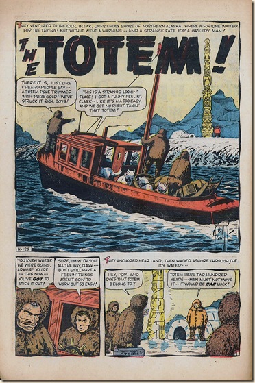
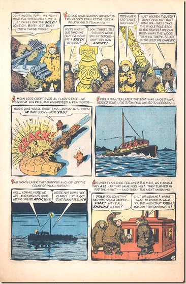
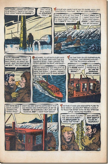


“The Totem” has the structure and feel of a fairy-tale, albeit with darker, heavier themes. It can be seen as a parable on colonialism, racism, and the sense of entitlement by the Caucasian antagonist. Everett also works in some of the fanciful mythology seen in his Sub-Mariner universe—the sense of a highly special culture that is hidden from the eyes of the “normal” world.
Al Clark, in his lust for the gold totem pole, and his lack of regard for the life, culture and well being of the native Alaskan, is caught in a nightmarish loop of ruthless self-aggrandizement. Each time he returns, he re-destroys the lone Alaskan’s igloo, steals the pole—and then finds himself (and his crew) smaller in stature, and back at square one.
Eventually, Al Clark shrinks to the same size as the sentient totem-pole people. In the story’s poetic-justice finale, Clark has become part of the object he once tried to possess.
This is more than a simple twist-of-fate E. C. type story. It’s not about revenge, as most comic book horror stories of the genre and era. “The Totem” takes into consideration the impact of different cultures on the “official” world of Caucasians. Clark, who sought to rob the native Alaskan of his cultural icon, becomes instead assimilated into the icon itself.
“The Totem” impresses on several levels—with its unusually thoughtful themes, with its confident, adroit visual staging, and with its inexorable narrative path. There is much more at play here than you might expect from a post-Comics Code story—or from a later ‘50s Atlas comic, period.
There isn’t another comics story quite like “The Totem.” Whether Everett was conscious of its heady themes or not, they give this story a haunting, convincing quality. The Comics Code did not blunt Everett’s gifts as a storyteller, commentator or graphic artist.
THE CARTOONIST’S CALAMITY (1951)
Our final story today comes from a curious comic book that spanned the transition from 1940s Timely Comics to 1950s Atlas. Venus reflects the identity-crisis of the post-war American comic book. Is it a super-hero title? Romance comic? Horror and science-fiction? Or is it a light-hearted, humorous approach to mythology? Venus is all these things. In its 19-issue run, it bounced off the walls of many comic book genres. I’m surprised it didn’t become a Western comic for a few issues.
Bill Everett inherited the Venus title towards the end of the series’ run. He was clearly inspired by its admixture of pin-up art and anything-can-happen narratives. His fairy-tale sensibility resounds through these comics, which we can safely assume he wrote and drew.
One of three stories by Bill Everett in Venus #17 (December, 1951), “The Cartoonist’s Calamity” stands out as both an astonishing exercise in style and also Everett’s own statement about alienation as it applied to the life of a comic book artist in the 1950s.
This playful story – written by Everett – also has a hallucinogenic aspect, with Everett using every stylistic trick in the book, and then some. Whew! This is truly a dazzling visual smorgasbord! Bill Everett’s highest level of investiture in this five-page filler story suggest that the story resonated deeply with him and was an inspiration and an invitation to let his own Id run free.
Jimmy Rogers, the harried protagonist of this story, is one stressed-out soul, at once alienated and alienating to others. The pressures of his job as cartoon editor of Beauty magazine (the home base of the Venus universe) have turned him into a hostile, sunken-eyed abuser. The beautiful, compassionate, goddess-come-to-earth Venus sees through his frazzled facade, and helps him overcome his inner demons.
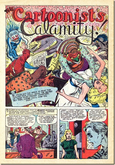

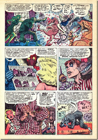
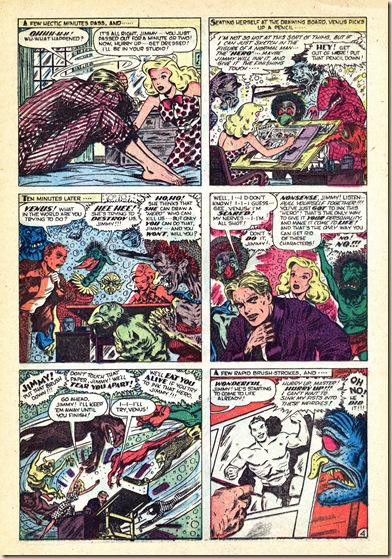
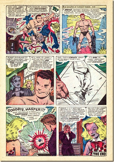
Rogers moonlights as a horror comics cartoonist, and the line between reality and his overheated imagination has been shattered. Imps of the perverse crowd around his drawing board and taunt him. They’re unlike the ghouls and brutes of typical horror comics. These leering, taunting Id-monsters interrupt Rogers' sleep, and cause his confidence and good nature to dissolve. He stands between the world of “reality” and the world of comic book horror the way Everett’s half-breed Sub-Mariner stands between two worlds. So, even in a fun trifle, Everett’s obsession with alienation drives his work to rarely achieved heights and depths.
It’s fascinating to see a cartoonist depict his own world within the confines of a comic book story. Jack Cole famously caricatured himself into his 1940s stories a few times (sometimes as a hare-lipped, stuttering oaf), but his creations never threatened his well-being.
It’s tempting to see Rogers as a stand-in for Everett. Whether that’s true or not is lost to time. “Cartoonist’s Calamity” has a pell-mell energy, full of lurid humor and grotesquerie. The first panel of p.3 depicts the rift between the real world and the realm of imagination and creation.
It takes an outsider to the world of cartooning—Venus herself—to provide the solution to Rogers’ ink-stained dilemma. She roughs in the figure of “The Hero,” and encourages Rogers to ink her sketch. “The Hero” bears a strong resemblance to Everett’s Sub-Mariner. He cheerfully dispatches the goblins, de-calamitizes Rogers’ life, and dutifully returns to the inkwell.
Rogers’ melodramatic statement that he’ll never draw horror comics again is met with Venus’ pragmatism. “Let’s get back to work,” she suggests with a smile. Rogers is no longer the prisoner of his imagination, and Venus has proved a heroic outsider. As “The Hero” cries out, on his exit, “Your ladyfriend is positively ingenious!”
April, 1970: Bill Everett at a Comic Book Convention three years before his death 
Bill Everett’s theme of alienation runs through a great deal of his work, from the angry, anti-hero figure of Prince Namor (The Sub-Mariner) to his many excellent short stories in the 1950s. Surely, Everett’s fixation on this theme suggests that he saw himself as a kind of outsider, as well.
As we hope we’ve shown you here, Bill Everett’s work certainly deserves more study and appreciation than it’s been accorded. Blake Bell’s recent biography of Bill Everett, Fire and Water, is a great place to start. In Bell’s book, we learn that Everett struggled with alcoholism and had many self-defeating patterns in his life. Just considering his career in comic books alone, it is easy to see why Everett felt alienated. Here was a major pioneer in the form, a guy whose creative genius was a pillar of the company that became very successful, and he was treated as just another contract laborer for 30 years.
However, towards the end of his life, Everett rose above his own problems, and became a very giving and compassionate person that felt connected to the world. He was a very strong participant in Alcoholics Anonymous, sponsoring and supporting the recovery of many others. As Bell recounts, at his funeral in 1973, the many people from the comic book industry that attended were astonished to discover they were hugely outnumbered by people from the AA community. Everett may have felt a profound sense of alienation in his life and career, but thankfully, at the end of his days, he found his place in the world.
Now, what the world needs are some good-quality, annotated Everett anthologies. There exist literally dozens of such stories in Everett’s little-explored 1950’s comic book work. We will, as time permits, look at more of these. But, for now, we hope you had fun rooting around in the old Comic Book Attic (sound of echoing, ominous laughter and the smell of decaying paper….)
Note: Be sure to check out Doc V.'s amazing article on Bill Everett's ATM romance comic book stories at his blog, Timely-Atlas-Comics: http://timely-atlas-comics.blogspot.com/2011/03/bill-everett-timely-romance-stories.html
All text copyright 2011 Frank M. Young and Paul C. Tumey; thanks to Doc V. for his feedback and clarification

Great post, Guys. Let me make one correction. The MARVEL TALES #140 cover artist was not Joe Maneely. That "scratchy" style depicted was Carl Burgos!
ReplyDeleteDoc V.
Thanks for the art ID, Doc. Stan Lee was so fond of that Maneely "scratch" style that it's hard to tell the genuine article apart from simulations!
ReplyDeleteOne good way to compare the two is Burgos at this time used all that "hay". Maneely was cleaner with an almost wood-cut etching technique. There are signed Maneely covers with the "scratch" effect and this is due to Burgos going over them as a cover editor of sorts. It completely destroys the Maneely. One good example of this is SPELLBOUND #24. The cover is signed by Maneely yet completely re-finished by Carl Burgos. I have a scan of the original cover by Maneely "before" Burgos touched it. It appeared on a Mexican Atlas reprint!
ReplyDeleteWhen the subject of Everett comes-up, I always think back to the sadness that I felt, and then again feel, at the announcement of his death. He had come back to us, and then he was just gone for good.
ReplyDeleteI have to applaud anyone who'd acknowledge that some of Stan Lee's stories were “dirt-dumb”.
The return of the, uhm, especially fictitious hero to the ink-well is of course in imitation of something that used to routinely happen in Fleischer cartoons.
One thing this post brings to mind is the truly awful way Marvel presents reprints from it's archive today.
ReplyDeleteWhile I would love a have collections by Matt Fox, Everett, and Krigstein, Marvel continues to issue collections oriented towards complete reprints of individual titles, rather than collecting the work of individual artists. This makes their collections very much the same as the original comic books, a small percentage of interesting material buried in a heap.
Funnybook Attic wrote:
ReplyDelete"There exist literally dozens of such stories in Everett’s little-explored 1950’s comic book work."
This is true. My next blog post (almost done) will present a complete look at "all" of Everett's Atlas romance stories. A previous post (the current one) covered the Timely romance tales and I think I made a decent case showing some of them were penciled by other artists.
About the comment on Marvel's reprinting complete titles rather than artist volumes, I think the reason is that they tried something like that about 5 or so years ago in the "Marvel Visionaries" series, putting out volumes of the "best of" type on Jack Kirby (2 volumes), Steve Ditko, John Buscema and John Romita. I believe the series was stopped while a Gene Colan volume was in production because the sales were very poor. So the idea of artist volumes are not favorable any longer. I would love to help them put together some Timely/Atlas artist volumes if they were interested.
I'm a big Everett fan, so this was a nice little article (saw it on today's TCJ blog). I recommend Blake Bell's biography/retrospective, and it should also be noted that Fantagraphics is doing an archival project of Everett's works. I'm not sure of the details, such as what exactly will be reprinted (I'm assuming it's non-Marvel), but I do know that the first volume will be out later this year, and it looks to be similar to their Steve Ditko archives. Bell also did a similar biography of Steve Ditko, so it's a nice little series, so to speak.
ReplyDeleteI mean, it's pretty pointless to complain about Marvel's output these days - that kinda goes without saying. But it especially annoys/frustrates me that Everett's creation Namor is so underutilized.
And Mr. Ed: agreed, Marvel Masterworks aren't really that great, as far as their reprint philosophy goes. I understand that a huge company with a huge backlog wants to get everything out there - it's good stuff for the Marvel fans, I think. But for fans of more specific creators and whatnot, it pales in comparison to all the other archival editions out there. A while back Marvel was publishing big hardcovers, called Marvel Visionaries, but now they seem to be focused on specific runs. I wish we could see a collection of Everett's work, not to mention a proper edition of Steranko's work. No such luck right now.
Anyways, I enjoyed your post.
Perhaps the "problem" with the Marvel Visionaries" books was they used a scatter-shot approach?
ReplyDeleteIn other words a scant collection of (common)random stories spanning a rather long period of time.
Fans do like an archived approach (I think). Fantagraphics, DC, and other publishers have success with making the cartoonist "The Star."
Paul Tumey here.
ReplyDeleteThank you all for your great comments. Doc V., it was your great article on Bill Everett's romance comics that inspired us to write the post above, exploring Everett's theme of alienation. Forgive us for not including a link to your blog. I've corrected that oversight, and have put in a link to the article at the end of our post. Hopefully, it will direct a few new readers to what is, I think, one of the best blog postings on old comic book stories that I have seen.
I wrote the sentence at the end of our article about there needing to some good-quality, annotated Bill Everett collections. Even though I wrote that, I'm sure my Comic Book Attic partner, Frank Young wholeheartedly agrees with that statement.
I was very specific in that sentence because I am familiar with the "Marvel Visionaries" series.To put it mildly, that series sucks.
First, the stories are printing on coated, glossy paper stock. This makes the art look terrible and the stories are hard to read. Second, as Mr. Ed notes above, the selection was very scattered and showed no informed discernment. Lastly, there were no notes. Any archival collection that aims to rescue forgotten artistic work from a long-ago era needs to have some informed notes and writing to help put the work in context and to support a full understanding and appreciation of it.
To my mind, the books created by Greg Sadowski for Fantagraphics, especially "Supermen!" and "Four Color Fear" are model examples of how to do this right. I understand Sadowski is working on a volume of Atlas horror comics to be published by Fantagraphics that will no doubt include some fine examples of Bill Everett's work. I'm greatly looking forward to this book. I can only hope publishers pick up on this approach and discover that the failure of the creator-themed collections was not due to the concept, but rather the inept execution of it to date.
Thanks again, everyone! ~Paul Tumey
Fanta has indeed put out some great archival works. The two you mentioned are great, and that Atlas horror collection sounds very appealing.
ReplyDeleteI've never read any of the Marvel Visionaries, actually, except that piss-poor reproduction of Steranko's work. That might have included all his work, which doesn't really amount to much, page count-wise.
Anyways, yeah, those collections never appealed to me as a fan of the creators or even as a Marvel fan. Too scattershot, not really comprehensive in the slightest. I was just pointing them out as the closest thing to creator-specific collections that Marvel has really done. It would be nice to see them make a creator-focused omnibus, instead of run-specific. I would take one of those unwieldy 800-page monsters if it collected all of, in this case, Everett's work. They did an omnibus of Golden Age Marvel (Mystery) Comics, but the poor reproduction quality in the Golden Age Masterworks series has me wary.
But talking about Marvel like that seems to be futile. I'll just quietly look forward to Amazing Mysteries, the Everett Archive I mentioned above. Here's hoping we see a second volume as well.
Marvel has made a couple of recent movers towards allowing outside publishers to package books Marvel apparently thinks won't appeal to the fans buying the "Masterworks" books.
ReplyDeleteAs mentioned above an Everett Atlas horror collection, and a series of books from IDW which will present high quality reproductions of original art.
I don't see where Marvel has anything to lose by allowing this. If a publisher were to approach them with the idea of licensing a collection of Matt Fox stories, Marvel could allow that without any risk, and retain future rights in the event the book did well enough that Marvel decided they ought to explore similar collections.
Paul wrote:
ReplyDelete"Thank you all for your great comments. Doc V., it was your great article on Bill Everett's romance comics that inspired us to write the post above, exploring Everett's theme of alienation."
Thanks Paul and I just updated my blog with another Everett piece. This time, ATLAS romance stories.
http://timely-atlas-comics.blogspot.com/
The theme of a horror artist or writer overcome by his own creation occurs in a famous Hank Chapman story (drawn by Wayne Boring) as well. Later, Stan Lee told the story that Chapman stopped writing horror stories because they gave him bad dreams. This could have been Lee remembering the Boring story and interpreting it as something that really happened, but it could also have a germ of truth. This idea could have been around when Everett did his Venus sory shortly after.
ReplyDeleteLovely article with even lovelier art! (I found this thanks to one of Blake Bell's Twitter posts.)
ReplyDeleteAbsolutely agree about Everett's abilities and under-appreciated greatness. I am fortunate enough to have owned a VENUS comic (before I had to sell it, unfortunately) and just drooled over the gorgeous art. I think Bill's best stuff was from that era, better than his mid-60s work on the Hulk and other superheroes. He was best with more aesthenic body types, and especially women.
Two very minor corrections if I may:
1) There's a wee typo in the 2nd paragraph under "Cartoonist's Calamity": He was clearly inspired by its *admixture...*
2) Regarding the borders on "The Totem"--I don't think they're freehand. They look to me like brilliant brush-ruling. This is done by leaning a ruler or other straightedge on its side at an angle, placing the ferrule of the brush against it and dragging it along to create the line (usually while twirling to maintain a point--in some ways tougher than freehanding).
What it looks like Everett did was expertly vary the pressure while creating the line, giving it a wonderful thick-and-thin look that mimics the waves of water. Trust me, as someone who's been inking off and on for a few decades, it ain't easy, and another testament to Bill's skill--and creativity. Who else, especially back then, would take the time and effort for such a subtle bit of artistry? Not many!
Love that story, btw. I hope to find a good reprint of it. I do enjoy the Atlas and other reprints and Marvel Essentials. While I understand the need and desire for complete artist monographs, the economic truth is the audience for title/character completists far outweighs those for individual artists. (I know Greg Theakston has been trying to reprint every Kirby story in chronological order and hasn't been profiting much if at all, despite the legions of Kirby fans.) But I really, REALLY love the actual-size reprints from IDW in its Artists Editions. Damn expensive, but worth it if you can afford it. Would love one for Everett!
Thanks again,
Mike Pascale
Hiya Mike.
ReplyDeleteUtterly FANTASTIC site...gotta come back to it later today...sure thing!!
Mike: l have a drawing l done in pencil and ink of a Make-Believe 1950's Atlas Horror Comic SPLASH page.l have a feeling that you might like to see it...are you on FB~? if so let me know send me a Buddy request or l could send you one..so's l can get it to you.
Bestest to you Mike. Paul.
You guys fascinate me in that you truly analyze whats going on. I enjoy the discussion. Keep it coming.
ReplyDelete