We’re back with a fun-filled second installment of our new blog! A special thanks go out to all the folks who emailed and commented on our first post, including Art Spiegelman (be sure to check out his insightful comments on the 1950’s horror genre and how it intersects with consumerism). We welcome your comments on this and future posts… it’s what keeps us motivated, folks!
Finding surviving golden age comic book production art is as almost rare as finding an honest politician. Quality Comics production art is rarer still, probably due to the fact that the publisher – in a career-long fit of paranoia – routinely destroyed nearly all original artwork, so that competitors could never reprint it (until scanners were invented).
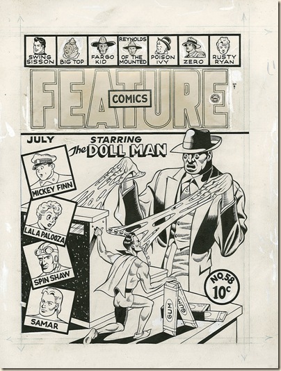
Here’s three choice examples of Golden Age production art that reveal a behind-the-scenes glimpse into how comics were made in the early 1940s. These examples were smuggled out by Quality writer, artist, and editor Gill Fox, who drew and produced these covers. Fox did an enormous amount of the early Quality covers. Our thanks to the fabulous Heritage Auction Gallery for these scans.
Thanks to Fox's squirreling-away of original art and other production artifacts, 21st-century cartoonists and comics students have an unusual opportunity to see how a production artist worked, circa 1941.
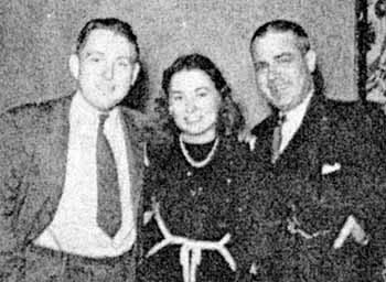
Gill Fox is shown here on the left, with his wife Helen in the middle, and Quality’s publisher Everett “Busy” Arnold on the right. If you look closely, you can see poking out of a vest pocket the scissors Arnold used to cut up countless pages of priceless comic book art. (Photo courtesy of the Alter Ego website)
Fox's poster-like, usually humorous cover designs are often crude, compared to his other comics work. His renditions of Doll Man and Plastic Man fall woefully short of the interior versions by Reed Crandall, Jack Cole, Al Bryant, et al.
These covers are more like circus posters than most contemporary comic books. Their bold, blunt lines, flat, primary colors and strong use of white space are a far cry from the cluttered, copy-heavy covers of Fox Comics' titles, the frenzied crowd scenes of Timely's, or the more elegant, streamlined efforts of DC Comics.
Fox's renditions of the Quality characters could often look a little disturbed.
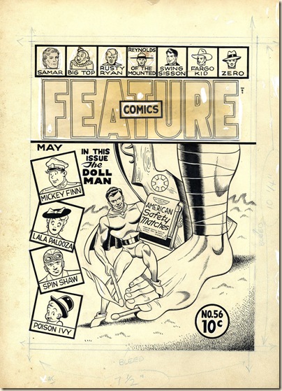
On this propaganda-enriched “Tokyo Toes” cover scene, the tiny hero bursts with glee as he gives a Japanese soldier an American hot-foot.
Although we only see the Japanese soldier's feet, legs and part of his rifle (note the rising sun logo on the rifle butt), the figure's pale yellow skin color tells us all we need to know.
These folks did things the hard way. So did all paste-up artists, art directors and other production personnel up to the Age of Photoshop, Quark, PageMaker and, now, InDesign. Tasks that once involved airbrushing, careful cutting of Rubylith screens, pastedowns of alignment markers and much notation can now be done by one person on one computer.
It's still hard work; it's much less tactile and time-consuming, thanks to these remarkable digital tools. It took a team of draftsmen and production workers to turn the bold inklines of a Gill Fox cover into the glossy, smeary, mass-produced pulp paper pamphlets that beckoned from the crowded news-stands of America.
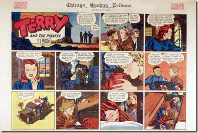
Comic books rarely attempted the sophistication and subtlety accorded major newspapers like The Chicago Tribune which, well into the 1950s, utilized the skills of European production virtuosos. A look at an average Tribune Sunday comics section of the 1930s, '40s and early '50s reveals delicate shadings, gradations and airbrush-like effects which still look dazzling and elegant.
Gill Fox's method for coloring comics covers seems unusual, even for its era. The conception of Quality's covers differed from their competitors, as well. Their original art was drawn at a smaller-than-normal size: 8.75" by 12".
In comparison, original art for the interior stories was typically done "twice up" from the typical published size of approximately 7.5" x 10.5". All the cover elements are hand-drawn--there is no mechanical typography.
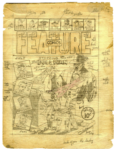
Of particular interest is Fox's laborious coloring method.
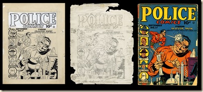
He traced the elements of the original art, rather loosely, onto tissue paper, in simple, blunt pencil lines. These tracings are notated, very simply, with the desired colors. Yellow is just yellow—that radiant, flat process shade that still stands out, even on tired, time-worn copies of the surviving comic books.
As can be seen in this coloring guide for the cover of Feature Comics #56, Fox's simple instructions translated easily to the printing press. While there are no subtle shades, as were found on the contemporary covers of DC, Fox or Fawcett's comics, the colors achieve their desired goal. Bright, eye-catching and sharp, the Quality covers remain impressive eye-candy.
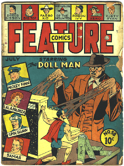
Sidebar co-stars Mickey Finn and Lala Palooza share in Doll Man's demonic glee. Poison Ivy seems to be saying here, “Ennybody gotta spare hemeroid pillow?”
In Fox’s art for Feature Comics #58, wooden, awkward human figures dominate, with its weak gag idea beautifully rendered in Fox's precise brush lines. The speckled black area of the cash register is elegantly achieved. The published cover uses a flat cyan and a bright orange to great effect.
Some paste-up of standing elements is evident--some of the headshots of the magazine's recurring characters are re-used from previous issues. But other vignettes--and, even, the comic book's title—were redrawn from issue to issue.
Fox was a slick inker. Although the figures on these covers are all awkward, their sinuous, lush lines are tight and assured.
Fox's forte was in humorous cartooning, but he was a professional technician--which was a true asset in designing and executing these clarion-call cover images.
It's fascinating to examine the paste-ups, white-outs and production-staff scrawlings on the artwork itself. Ditto for the tattered, wrinkled color guides, with their sometimes-grotesque tracings and various notations.
These preliminary pieces were never intended to be studied or seen. They were just a means to an end--to achieve a colorful, attention-grabbing cover that competed for millions of dimes on America's news stands, magazine racks and corner stores. Most readers probably had no idea--nor any curiosity--of how these comic books were created or produced.
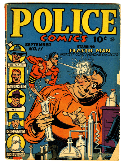
This historic cover is the first of the Police covers featuring Plastic Man that begins to capture the anarchic, comic spirit of Jack Cole’s series. Gill Fox mentioned that this was his most-requested Golden Age cover image. It's a curious scene: a tiny Plastic Man (his size here suggests Fox was still in his Doll Man mode) sprays a mouthful of chemicals into the face of an apparent bad guy. It's not clear what he's doing, or why it's considered worthy of Plastic Man's aggression. The orderly array of test tubes, Bunsen burners and bottles suggests a well-tempered, organized scientist rather than a death-ray-wielding madman.
Fox's woodcut-like precision, and the stiffness of his characters, makes this scene still vivid. Again, he uses the foolproof cyan and orange color scheme, with Plastic Man's primary red and daubs of process yellow for simple, effective contrast.
Gill Fox would soon be knocked off the Quality covers by the more fluid, accomplished artwork of Jack Cole, Lou Fine and Al Bryant. Cole, in particular, was a master designer of the comic book cover. Fox's bright, primitive drawings have an appeal all their own, and his preservation of these unique artifacts from comic books’ musty history gives us a window into the work that brought this medium to its heights of popularity in the early 1940’s.
All text copyright 2011 Frank Young & Paul Tumey





Absolutely AMAZING post.
ReplyDeleteThe evident love that you guys have for this material is revealed in the fascinating and engaging way you reveal not only great iconography from the "golden age" of comics, but also shed light on the techniques that artists such as Fox employed.
All of which helps to contextualize each and every post you so generously share with us.
Just found you, keep up the good work!
ReplyDelete